TriniTuner.com | Latest Event:


Moderator: 3ne2nr Mods

hassanvoyeau wrote:SVG logo design. TTT Limited. (3d version, 2nd version).
*Suppose to be a futuristic satellite something. TTT is in the middle. Spent 3 hours on this logo. Got carried away with it and making changes.
What you think?

Thankseurotuner wrote:They are quite clever. 8/10. Signed 12yr plus senior designer.
Honing my skills. I am a newbie at logo design. I love SVG format because it scales without losing quality. Specifically shared the TTT logo because I think they need a better logo than they currently have.VexXx Dogg wrote:Is this for some kinda contest? or are you just redesigning logos for shits and giggles?
Gotcha. The ttt looks great. The casemix for your name is confusing thohassanvoyeau wrote:Honing my skills. I am a newbie at logo design. I love SVG format because it scales without losing quality. Specifically shared the TTT logo because I think they need a better logo than they currently have.VexXx Dogg wrote:Is this for some kinda contest? or are you just redesigning logos for shits and giggles?

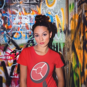
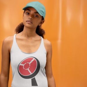

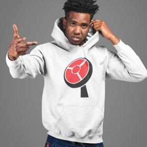
It's the 3d version of the logo. There is a flat version, monochrome version, with company name version, letterhead version, etc. Also, I don't think that is normally how logos are sized and placed on clothing and especially company logos. This here is from Microsoft's merchandise storeMonk BANzai wrote:Did some quick mock ups with your TTT
The primary role of a logo is to identify… Remember this, as it trumps all other advice you’ll ever hear. Identification is what really matters. That’s it.
Trends come and go, design tools and techniques will evolve, what we perceive a logo to be may even drastically change with time, but for all eternity the single most important goal of a logo will always remain this – to identify the person, product, business or service you’re designing it for.

hassanvoyeau wrote:It's the 3d version of the logo. There is a flat version, monochrome version, with company name version, letterhead version, etc. Also, I don't think that is normally how logos are sized and placed on clothing and especially company logos. This here is from Microsoft's merchandise storeMonk BANzai wrote:Did some quick mock ups with your TTT
microsoft.jpg
Purpose? I like how it is stated in this article - https://logogeek.uk/logo-design/why-logos-matter/ -The primary role of a logo is to identify… Remember this, as it trumps all other advice you’ll ever hear. Identification is what really matters. That’s it.
Trends come and go, design tools and techniques will evolve, what we perceive a logo to be may even drastically change with time, but for all eternity the single most important goal of a logo will always remain this – to identify the person, product, business or service you’re designing it for.


worksux101 wrote:Personally don’t see anything wrong with the current ttt logo.
Simple, expresses their brand clearly and given the push for online and on demand media, the play button illustrates their intent and service in an easily adaptable fashion.
Trinis don’t like change, especially when it comes to anything that makes them nostalgic...ttt simply falls in that category.
Nah not a central ting. First time I heard thatK74T wrote:Dunno if it’s just me but I’ve never heard anyone refer to the new TTT as the “777 station”
Mussbe a central ting
Return to “Ole talk and more Ole talk”
Users browsing this forum: pugboy and 15 guests
